News
Spicing things up
Air Canada turns 80 in April and has reconnected to its roots with an eye-popping new look. The airline also wants to seal its status as a global brand and leverage several operating advantages to boost international market share out of Toronto’s Pearson International Airport, where it lags other global powerhouses such as British Airways, Emirates and Lufthansa at their primary hubs.
March 6, 2017 By David Carr
 Air Canada is the new black
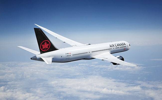
The historic Rondelle – a stylized red maple leaf inside a circle – which had been banished from the tails of the Air Canada fleet since 1993, has made a triumphant return as the centrepiece of a bold new livery, highlighted by a black tail, engine nacelles, aircraft belly and flight deck windows.
“I followed airline liveries as a kid,” Benjamin Smith, Air Canada’s president of passenger airlines and the driving force behind the return of the Rondelle said. “My favourite was when Air Canada was first rebranding from Trans Canada Air Lines. My position was to return to some of those elements and to show our Rondelle much more prominently.” The black flight deck windows and word mark across the front of the fuselage are other nods to Air Canada’s original 1964 design and black nose cone.
The new paint job was unveiled simultaneously at Toronto, Montreal and Vancouver, using Air Canada’s first Boeing 787-8 and two Airbus A320 aircraft respectively. The airplanes were the centrepieces of a broader reveal that included new company uniforms, menu choices and wines, showcasing some of Canada’s best design and culinary talents. This is the future Air Canada.
“Our customers are becoming more sophisticated in their tastes and the standards of service they are looking for. Our flights are getting longer as we start to fly further,” Smith pointed out. “You can’t just do that with airplanes. It comes from the livery, uniforms, food and wine. You put all of this together to come out with a brand promise that meets or exceeds the expectations of a very discerning clientele.”
Mack Ferguson, a brand specialist at the Toronto office of British-based Brand Finance believes the company is onto something. “What they are doing is quite clever,” he said. “They are competing against much bigger global airlines with a distinct Canadian brand to drive international business class traffic, which has higher margins than domestic traffic.”
Air Canada has climbed 12 spots to 22 on Brand Finance’s annual ranking of the country’s most valuable brands (replacing Bombardier, which tumbled to 23). A brand is an intangible asset that can protect a company’s value, especially during turbulent market conditions. Brand Finance ranks brands based on several factors, including marketing investment, familiarity, loyalty, staff satisfaction and the proportion of overall business revenue that is contributed by the brand.
“There is no question if you look at Air Canada, they climbed because of investments in marketing and advertising, the tremendous job they did squeezing costs out of their system and how their brand is perceived in the market place,” Ferguson added.
The new fleet design was created by international design firm Winkreative, headed by Canadian entrepreneur Tyler Brûle, whose previous work includes a complete rebrand and simple red and white aircraft livery for Swiss International. “There was a real ambition laid in front of us,” Brûle recalled. “The design wasn’t supposed to be the best in eastern Canada or the best in North America. We were going global.”
Brûle was keen to avoid what he described as the “trickery” of other airline designs, which he said includes shades and shadow and are sometimes loaded down with multiple layers of decals. “You see some airlines with simple red, white and blue, but it is quite a complicated livery. The exercise of painting these aircraft is very much simpler.”
Smith pointed out that the new livery is less intense and more environmentally friendly than Air Canada’s previous “toothpaste” livery. “It passed our bean counter test,” he said. “It uses less paint and we won’t have to paint the aircraft as often.”
The Rondelle, which also features prominently on the front lower fuselage, aircraft belly and inside engine to reaffirm brand awareness from inside the cabin was first stripped from Air Canada tails in 1993 by American chief executive, Hollis Harris. The signature piece continued its exile in American-cum-naturalized Canadian Robert Milton’s company rebranding in 2004.
Less clear was the choice of colour. There was a lot of back and forth before the company ditched traditional red and white for black. “It took over a year,” Smith said. “To get a livery going needs a long time to get it just right. We had a very strong symbol of Air Canada with our trademark Rondelle and we wanted to see it back on the tail of our airplanes. Then of course the experts took over.”
“What was interesting was where we ended up,” Brûle picked up. “We decided on the design whether it was going to be red or dark blue. Then we were just tweaking the pantones a bit.”
“Once we agreed on the black it was incredibly fast,” Smith added. “We agreed on black in May and here it is February.” Indeed, the bigger challenge was keeping the design a secret.
Brand Finance’s Ferguson believes Air Canada landed on the right colour for the market they are chasing. “Black luxury cards are sophisticated. Dark blue cars aren’t. They are presenting themselves as a sophisticated international airline. It is a refreshing change from fighting over discounted fares and bringing your own lunch,” he said.
It will take up to four years to repaint what Smith described as Air Canada’s “most prominent billboards”: its fleet of 300 mainline and regional aircraft. The company’s rouge leisure airline will maintain its distinct red, white and burgundy livery, with an enlarged and cropped version of the Rondelle on the tail.
The current mainline fleet of 787s and 777s will be repainted within 18 months. The remaining 14 787s on order and the first 737 MAX aircraft, which are expected this December, will be delivered in the new paint scheme. All front-line employees should be kitted out with the new uniform by the end of the year.
The rebranding is the latest in a series of strategic pieces – including a modern, long-range fleet and long-term labour piece – in place to help Air Canada transition into North America’s first global hub airline. “There are strong U.S. domestic hub carriers, but none of them play the role of global hub carrier like many airlines in Asia and Europe,” Smith told Wings. “We are already the largest foreign carrier into the U.S. You can’t transit in the U.S, but for international customers, you can transit out of Toronto, Montreal and Vancouver like you can in Amsterdam and Seoul.”
Smith especially wants to see Air Canada grow its share of international traffic out of Toronto’s Pearson International Airport above 50 per cent. “We are determined to get our international share up,” he said. “When you look at Toronto and its geographic location, we are sitting on a gold mine. We have five runways, no slot restraints, reasonable curfew hours and route rights to anywhere we want to fly. We have got a good shot at becoming a true global carrier.”